Wednesday, 27 August 2014

Panel one: Series of works


Series 1
The photos on my first panel are arranged in a brick-wall-type pattern, and each row is a separate series of works. The rows of three depict light and shadow through windows and blinds, and are used to document the passing of time throughout the day. My artist model for each of these series was Uta Barth, as she has similar photos taken through windows, as well as natural light from windows shining on walls. This particular series shows the light of dawn through blinds, contrasting the light with the darkness of the blinds, and begins the theme of vertical lines that runs through my whole first panel.


Series 2
This third row is the second use of light and shadow, this time showing the light coming through the blinds and hitting the walls. Again, my artist model for this series was Uta Barth, and this series continues the convention of vertical lines and using light and shadow as a subject.


Series 3
In the rows of four in between the series depicting light and shadow, the photos show the small details of everyday places, activities and objets, these specific ones taken in the bathroom, capturing the after-effects of a shower on the walls and floors. My main artist model for these photos was Rinko Kawauchi, who also captures small details of everyday things. I continue to use the convention of light in these series, like the light reflected in water droplets, as well as the lines running through my folio.


Series 4
This is the third series that depicts light and shadow, and the second one that shows the light shining through blinds and windows onto the walls. This time I took the photos from other areas of my house, showing how the light is affected in different places. My artist model for this series was Uta Barth.


Series 5
This is the second series that depicts the small details of everyday things, this one showing a messy slept-in bed. While I still used Rinko Kawauchi as an overall inspiration for this series, I also used Gareth McConnell as an artist model, as he also has similar photos of lived-in beds.


Series 6
This is the last series, finishing the board with the conventions of light and shadow and vertical lines. This series is similar to the first one, but this time it depicts artificial light hitting the blinds, contrasted with the darkness of nighttime though the blinds. The artist model for this series was Uta Barth.


Sunday, 10 August 2014

Artist model for panel two: Mauricio Guillen

One of the artist models I would like to introduce in panel two is Mauricio Guillen. 


Guillen has a series that documents a pink string being pulled through various places like houses and gardens. While Guillen used the pink thread as a symbol of boundaries and borders, I want to use it in my own work to act as a path through the photos. With my first panel, I wanted to depict monotony and routine, and a loss of direction in life. In panel two, the use of string or something similar could create a path, providing the direction that has been lost. It could also start to introduce colour into the photos, as my first board was mainly in earth tones, to enforce the sense of dullness. The main colour I want to use is red, not only because the string used in Guillen's work is pink/red, but also because red often symbolises life, lust, love and passion, which I want to show coming back into the world through my photos.

Another inspiration is the film The Sixth Sense. In the film, director M. Night Shyamalan used red only in scenes where the living crossed paths with the dead, and if red appeared in a scene where this didn't occur, he would remove it. As a result of this, the otherwise neutral palette of the film is interrupted by sharp bursts of red, the product being similar to what I would like to have in my third panel.


Sunday, 6 April 2014

New shoot: Contact sheets

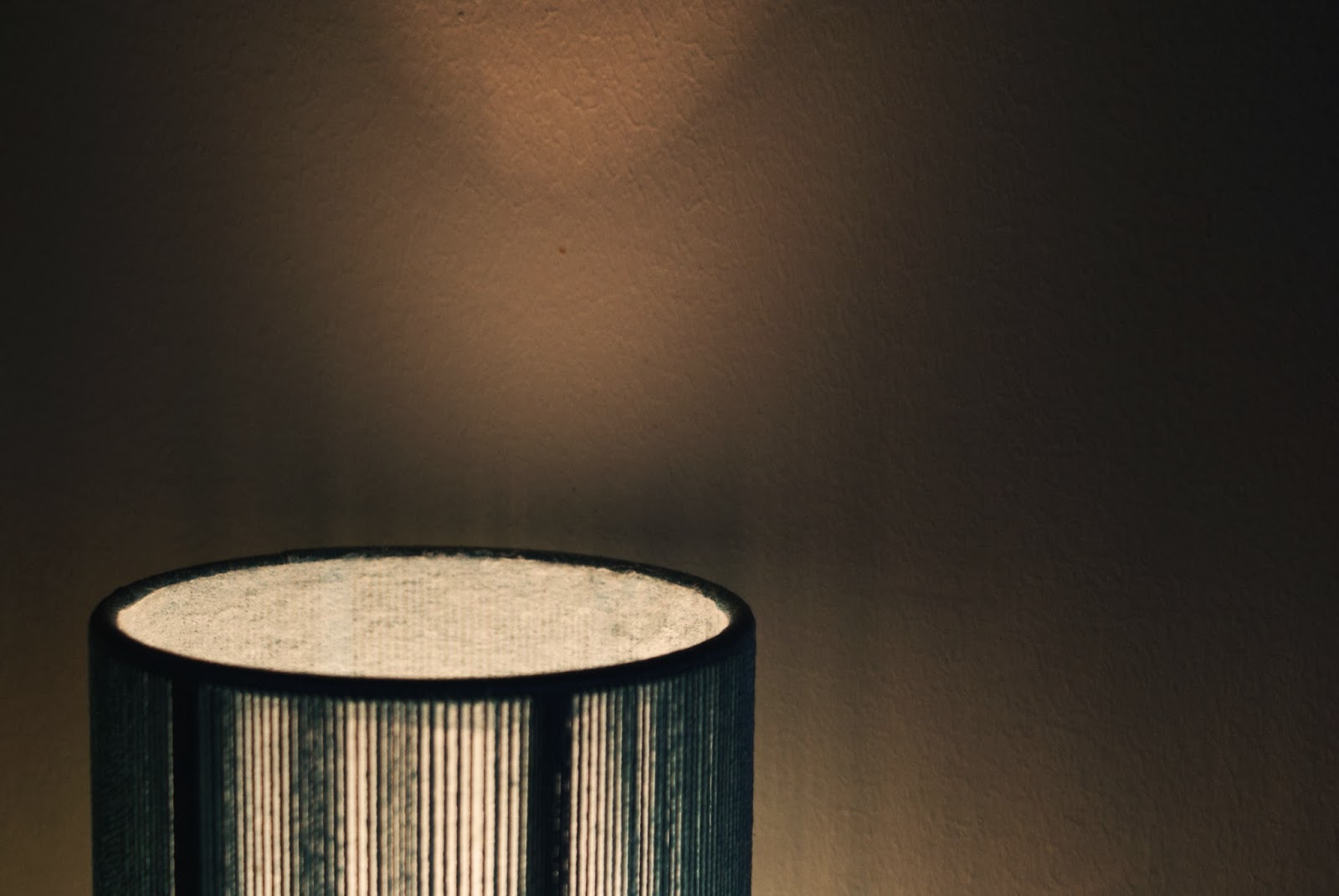
These are the contact sheets for the photos I took at home over the weekend. I never got much sun to take the photos I wanted to take, so I ended up just taking photos of random stuff around my house, using lines and framing a lot, and trying to keep my artist models of Uta Barth and Rinko Kawauchi in mind. I like the photos, but I'm not really sure what I can do with them or where I can go with them.


Sunday, 16 March 2014

Practice shoot: Channeling Uta Barth and Rinko Kawauchi

These are a few practice shots I took from just around my house, trying to focus on the little details of everyday things and incorporate the styles of Uta Barth and Rinko Kawauchi. I'd like to look into this more, by finding stronger subject matter and and further understanding their individual styles and and how they capture the imagery in their photography.


Artist models: Keith Carter

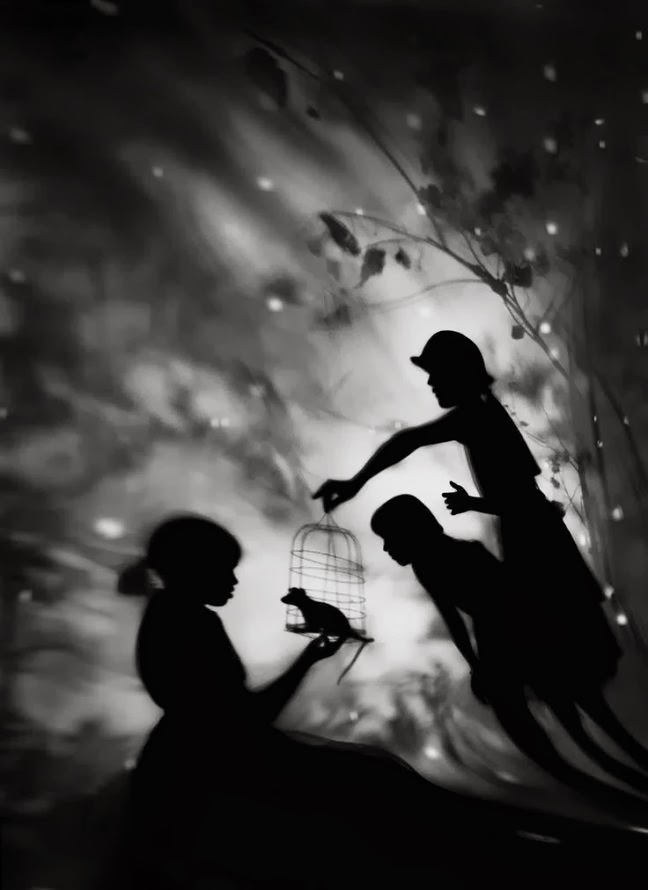
I like the strong use of contrast between light and shadow in Keith Carter's photography. Like Uta Barth's, his work also has a dream-like feel to it, created through the use of blurring and focus, and the shadowy black and white quality of the images.


Artist models: Uta Barth

I find Uta Barth's work to be similar to Rinko Kawauchi's, as she also captures everyday things in a simple way. But instead of focusing on small details, she draws the focus away from her subject matter, blurring the photos to give them a dream-like feel.


Artist models: Rinko Kawauchi

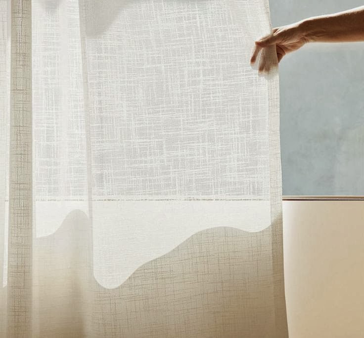
To me, Rinko Kawauchi's photos have a sense of nostalgia to them, which is something I'd like to incorporate into my own work. I like the simplicity of her photography, and the way she captures everyday things in a beautiful way, focusing on little details.